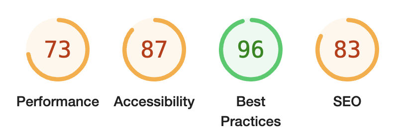
My site has a very basic home page. 2 images and a few links it should load quick right? This week I ran Google's lighthouse suite against the home page and was surprised to discover my performance score was 73. The page is completely static! No JavaScript required how could this be?
My portrait photo was the culprit, this image file is big and unoptimized resulting in potentially long load times for users on slower internet connections. Image optimization often has a large impact on page loadtimes but can be a hassle. I began searching for a solution for Svelte and found an official one!
@sveltejs/enhanced-img
The enhanced img module for Svelte provides a simple interface to optimize image assets with Vite. Setup is very easy, simply add the enhancedImages plugin to your vite.config.js.
import { sveltekit } from '@sveltejs/kit/vite';
import { enhancedImages } from '@sveltejs/enhanced-img';
import { defineConfig } from 'vite';

export default defineConfig({
  plugins: [enhancedImages(), sveltekit()]
});
Once installed and configured you can now begin replacing /static like I was.
<img src="/drake.png" alt="Portrait" />

<enhanced:img src="$lib/assets/img/drake.png" alt="Portrait" />
These assets must be relocated to the src directory because the images are no longer static assets. They will now be used to generate a set of optimized images at different sizes. When using a plain
<img src="/drake.png" alt="Portrait" />
After
<picture>
<source
    srcset="
    /@imagetools/9bb0792fd7f43bc3f051fdd821d4f9bac1655ccf 1158w,
    /@imagetools/e4451937d7b7f5b09b0c32e29e4db0dff8e4443b 2316w
    "
    type="image/avif"
  />

  <source
    srcset="
    /@imagetools/4cc9fcb136a0fe098b6d4b4bdee01c91f7faf162 1158w,
    /@imagetools/e1c831823a6c1b762603a78a7712d71d96ec86e8 2316w
    "
    type="image/webp"
  />

  <source
    srcset="
    /@imagetools/81aca07cab733adb25d1d13ed5b56188ad2c38f2 1158w,
    /@imagetools/272565fa283f0be931d09128f821a12fdafc848d 2316w
    "
    type="image/png"
  />
  <img
    src="/@imagetools/272565fa283f0be931d09128f821a12fdafc848d"
    alt="Portrait"
    width="2316"
    height="2919"
  />
picture>
We are now rendering a
Score Change
Here is my before and after lighthouse score, the only change here is applying an image optimizer to my build:
Before
After
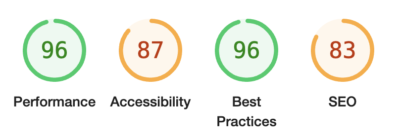
Great progress! Unfortunately this does not "just work" out of the box for my markdown files, so the images you are looking at right now are not optimized. I'll have to figure that out next.